SENIOR DESIGNER & CREATIVE LEAD
QLD, Australia
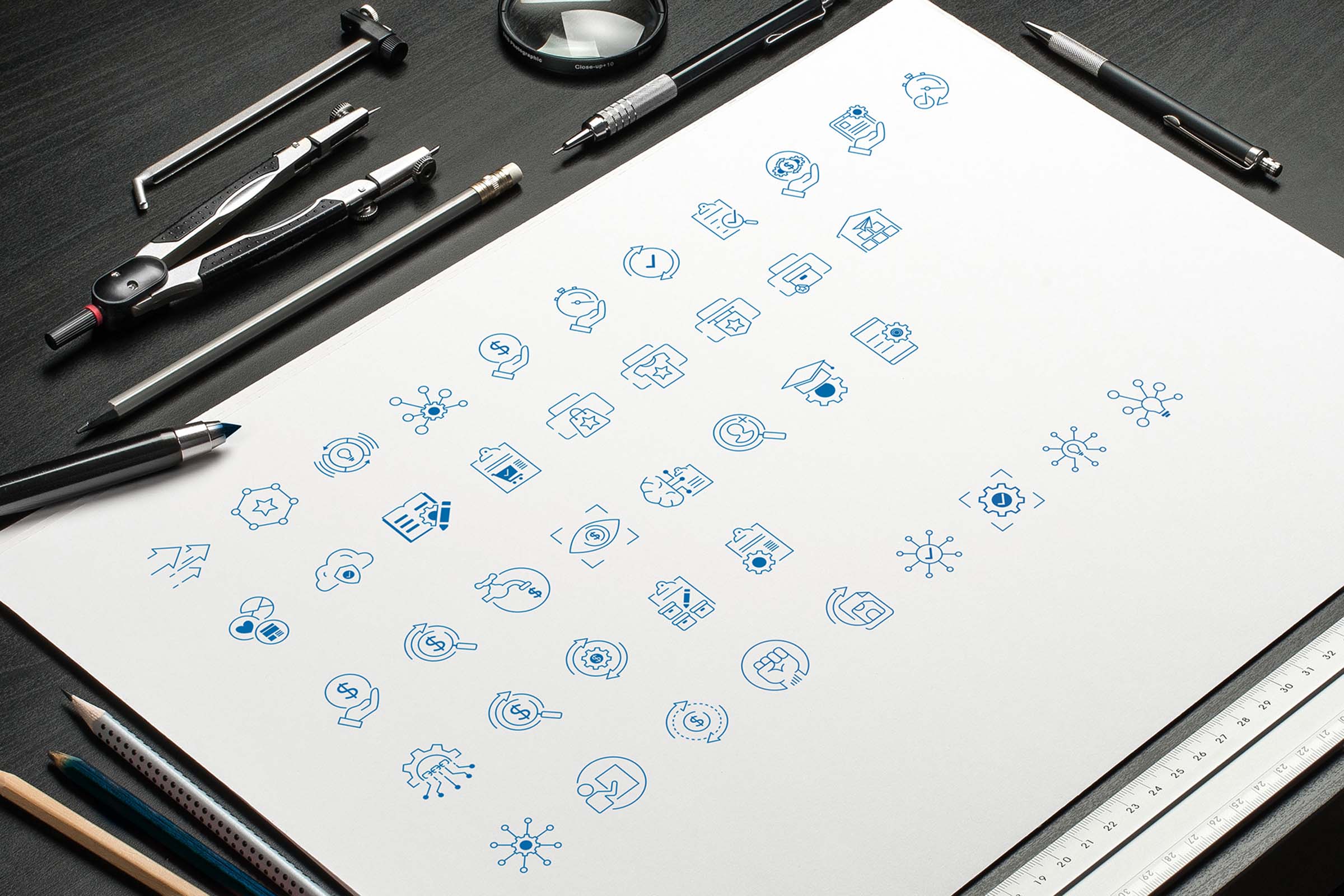
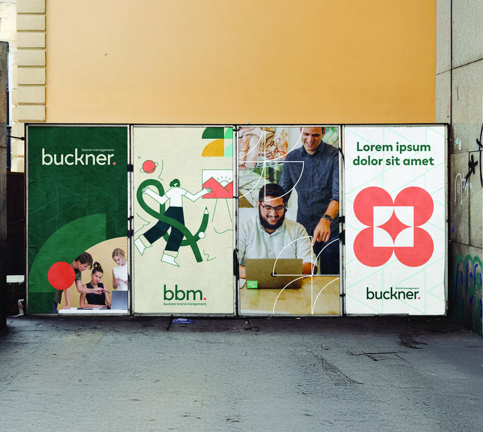
Clear communication was at the heart of this project. The Buckner Group required a visual system that could simplify complex information for both tenders and their website. The goal was to design icons and infographics that were not only functional but also visually consistent with the company’s evolving brand identity.
Website and UI design
Responsive layout systems
Design systems and style guides
Accessibility and usability principles
I created a library of custom icons with a unified style, ensuring they felt cohesive across digital and print applications. Each icon was carefully simplified to be easily recognisable at a glance, while colours and forms were aligned with brand guidelines. These icons were then applied within infographics, transforming data and processes into visuals that were engaging, accessible, and easy to understand.
The introduction of icons and infographics enhanced The Buckner Group’s ability to communicate clearly and professionally. Tenders and proposals became easier to navigate, while the website benefitted from a stronger visual rhythm and improved user experience. The result was a consistent system that supported both efficiency and brand recognition.
This project reinforced the importance of design as a language. Creating icons and infographics wasn’t just about aesthetics - it was about building tools that carried meaning, supported storytelling, and made information functional, accessible, and memorable.