SENIOR DESIGNER & CREATIVE LEAD
QLD, Australia
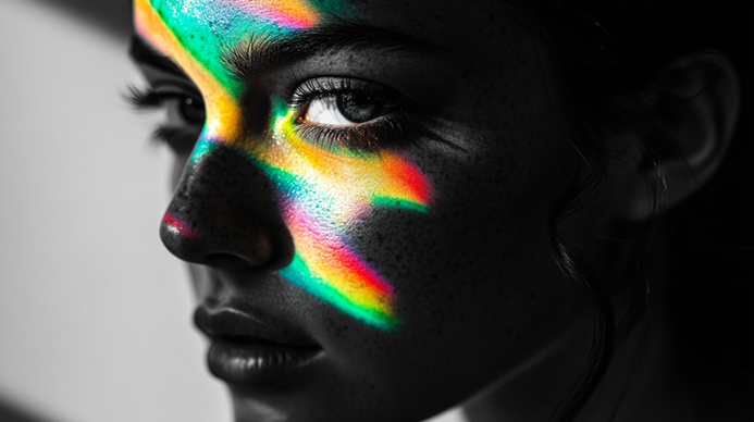
Colour is one of the first things people notice about a brand - and one of the things they remember the longest. But its power isn’t loud or obvious. It works quietly, shaping how we feel, what we associate with, and even the choices we make. In branding, colour is less about decoration and more about psychology.
The right colour palette gives people a sense of what to expect before they’ve read a single word. A deep navy might suggest trust and stability, while a bright coral feels fresh and creative. Good brand design uses colour as a tone-setter, making sure the first impression is the right one.
Colour isn’t just visual; it’s emotional. It taps into memory and feeling. A good brand strategy considers not just what looks nice, but what feels right for the audience. That’s why food brands lean into warm reds and yellows, while wellness brands often favour greens and soft neutrals.
Think of the brands you know instantly by colour: Qantas red, Cadbury purple, or Bunnings green. When used consistently, colour becomes a shorthand for recognition. Even a glimpse of it in an ad, on a shelf, or on social media can trigger the brand in your mind.
Colour doesn’t mean the same thing everywhere. In some cultures, white means purity; in others, it’s associated with mourning. A thoughtful brand strategy takes into account where the brand operates and how colour might be received in different contexts.
What makes colour powerful in branding is that it works quietly in the background. It doesn’t shout, but it sticks. Done well, it doesn’t just make a brand look good - it makes it feel right.
The quiet power of colour lies in its ability to shape perception without words. It’s not about choosing your favourite shade, it’s about choosing the one that helps people understand, trust, and connect with your brand.